A thesis submitted to the Delft University of Technology in partial fulfilment of the requirements for the degree Master of Science in Geomatics.
Professor: |
|
Supervisor: |
|
Co-reader: |
|
Timeframe: |
October 2009 - June 2010 |
Location: |
Delft University of Technology, Section GIS Technology |
Report: |
Download the PDF of the thesis from the TU Delft repository |
Paper: |
Published in the International Journal of Geographical Information Science |
Defence: |
Summary and aim
The objective was to develop a method which automatically segments and classifies movement trajectories (i.e. GPS traces) for ten different transportation modes (car, foot, bicycle, train, etc.). The developed method relies on the use of an extensible fuzzy expert system, and it uses OpenStreetMap to find relations between the trajectories and mode-related geographic information (e.g. railway tracks, bus stops, roads) to facilitate the classification.
The main data source of the trajectories is the Section Urban and Regional Development at the same department, which acquired the vast data in the scope of a research project. The data contain trajectories of total length of over 500 000 km with over 16 million sampled GPS points.
The built prototype can be used to segment and classify any movement data acquired in any country in any timeframe and sampling period.
The abstract of the thesis can be found here.
Publications
Journal paper: Transportation mode-based segmentation and classification of movement trajectories
with my supervisors Hugo Ledoux and Peter van Oosterom
In: International Journal of Geographical Information Science, February 2013, vol. 27, no. 2, pp. 385-407.
PDF DOI BibTeX@article{2013_ijgis_transportation_mode, author = {Biljecki, Filip and Ledoux, Hugo and van Oosterom, Peter}, title = {{Transportation mode-based segmentation and classification of movement trajectories}}, journal = {International Journal of Geographical Information Science}, year = {2013}, volume = {27}, number = {2}, pages = {385--407}, month = feb, doi = {http://doi.org/10.1080/13658816.2012.692791} }The thesis Automatic segmentation and classification of movement trajectories for transportation modes
PDF DOI TU Delft repository BibTeX
@mastersthesis{BiljeckiMSc,
    title = {{Automatic segmentation and classification of movement trajectories for transportation modes}},
    school = {Delft University of Technology},
    year = {2010},
    address = {Delft, the Netherlands},
    month = jul
    doi = {http://doi.org/10.4233/uuid:654587d2-6e93-4619-ab9a-29d95f843f35}
}
A position paper for the AGILE 2010 International Conference on Geographic Information Science, Workshop on Movement Research
Guimarães, Portugal 11 May 2010
Supported by the MODAP project.A presentation at the Workshop on Modelling Moving Objects
Informatics Institute of the University of Amsterdam 13 April 2010
Graphics
Apart from the aim of the thesis, the nature of the project and the amount of available data resulted in an endless resource of interesting plots. Some of them are published in the thesis, and are given here with a few unpublished items.
The objective of the research was to build a method which from a vast amount of movement data:
automatically identifies the used transportation modes:
Because of the amount of available data and the classification, it was possible to generate interesting plots, some not directly related to the objective of thesis.
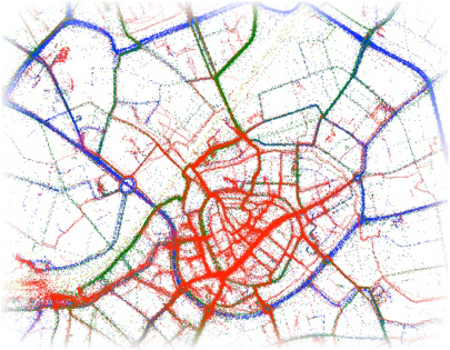
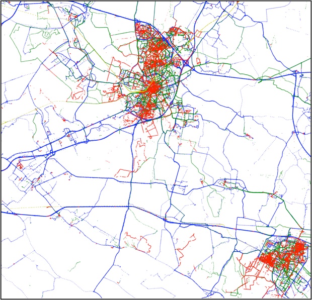
Next is shown a plot of the classified data in the spatial extent covering the city of Amersfoort, the Netherlands. The plot contains over a million GPS points of thousands of trips made by hundreds of people. The red colour represents walking, while green are traces from bicycles, and blue from cars. The yellow colour (slightly visible in the diagonal trajectory) represents journeys made by train. Note the aggregation of the yellow points at the two train stations in the city (upper-right corner, and the other in the lower-left).
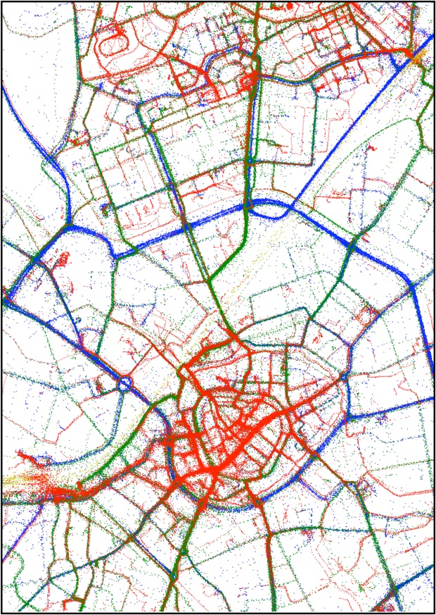
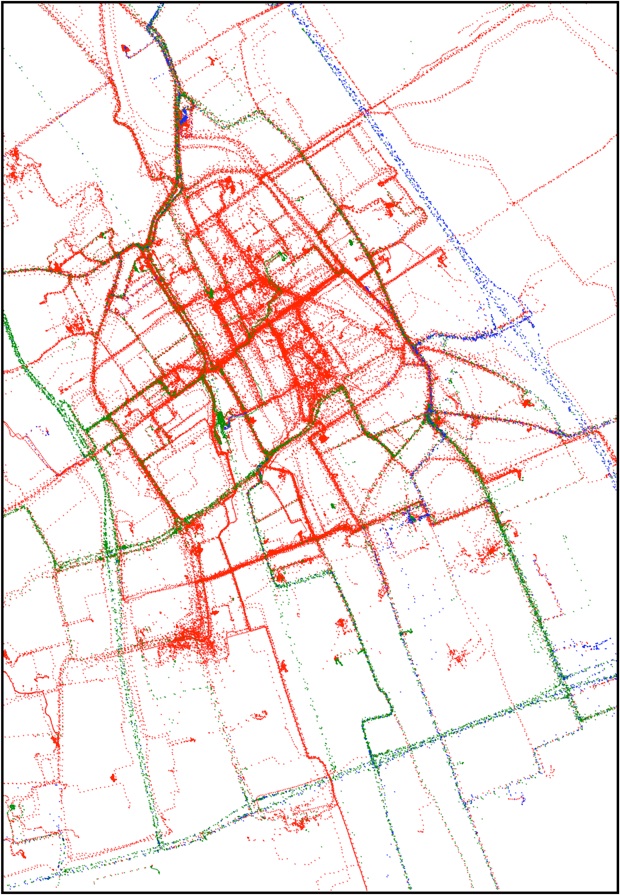
The images contain the four modes car, walking, train, and bicycle since these are the most frequently used in the Netherlands, and the inclusion of other classified modes (bus, tram, metro, etc.) is left out for aesthetic reasons. The next plot shows a larger spatial extent where the nearby city of Veenendaal is visible. The railway which runs through Amersfoort is clearly visible, as the intercity highways from the concentration of blue (car) trajectories.
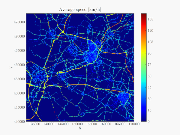
The centre of Delft is mostly pedestrianised. The bicycle paths of the TU Delft campus are also clearly visible (south-east). In wider roads it is possible to distinguish the lanes.
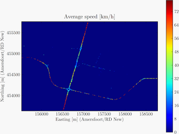
Plotting the speed of points clearly reveals the type of roads.
The speeds are in kilometres per hour.
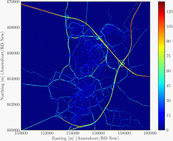
The same type of plot of a wider area (the cities Utrecht, Amersfoort, and Veenendaal can be recognised).
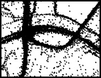
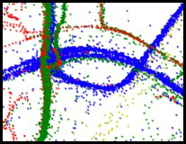
Zooming in the data is also interesting because it is possible to see the collective deceleration before roundabouts, traffic lights and similar traffic features.
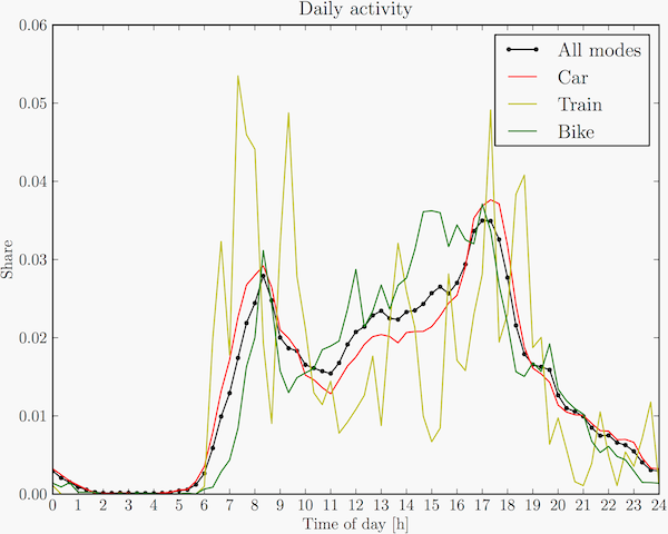
At the end of the project after the whole dataset was finally classified I generated other non-geographic plots, such as the analysis of the usage of various transportation modes over time. The peaks of general movement (black) can be found at rush hours.
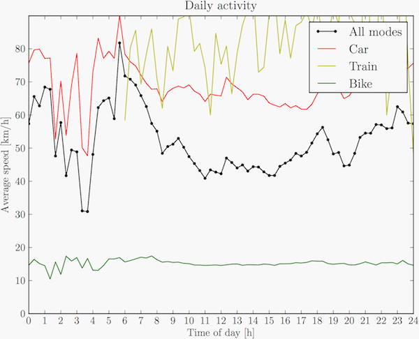
It was also interesting to examine the average speed of the frequent transportation modes (car, bicycle, train) over time of day. The sudden decrease at rush hours is due to traffic jams. The speeds of trains and bicycles are stable since they are not significantly affected by traffic jams.
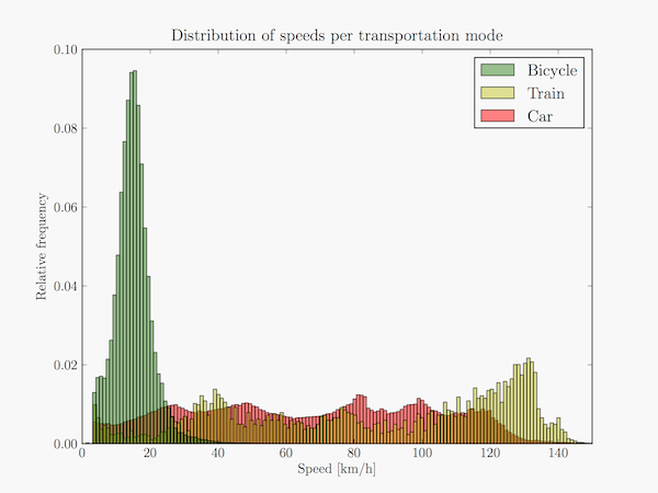
The distribution of speeds decomposed for the frequent transportation modes shows interesting peaks for cars (values close to speed limits). Once again, the system classified between ten different modes, but here I outlined just three modes for clarity.
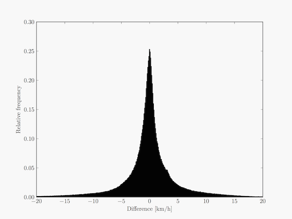
In frequently sampled trajectories the approximate speed at each GPS point was obtained in two ways: from the value directly calculated by the GPS receiver (thanks to the Doppler shift), and the distance between two subsequent points over their time difference. The latter is rather an average value of travel between two points, but since the sampling periods were frequent enough this data was good enough for this purpose.
The next plot shows the differences between these two values in a histogram (to me it looks as a Laplace distribution).
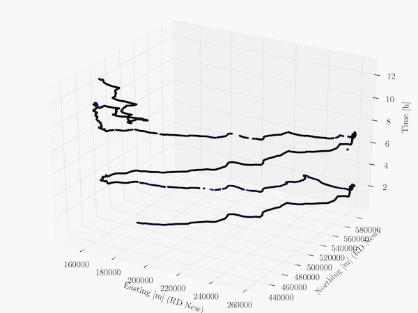
Now something different. Here is the spacetime plot (2D+time) of two similar journeys of the same person in two consecutive days (commuting + a small trip).
All plots had been generated with Matplotlib.
Thanks to the Section Urban and Regional Development at the OTB department for sharing the movement data that I have classified in the thesis.
Feel free to contact me if you would like to use some of the images for your needs.